20-35% of people with eating disorders have traits of autism.
That’s one of the first things we learned when we met with the research team at The University of Edinburgh to talk about The Eating Disorders and Autism Collaborative (EDAC). As surprising as that statistic sounds, even more surprising is the fact that very little research has been done to investigate this strong link until now. EDAC is one of four research projects in a new joint funding commitment from the Medical Research Foundation, the Medical Research Council, the Economic and Social Research Council, the Arts and Humanities Research Council and the National Institute for Health and Care Research, which aims to address the ‘vicious cycle of underfunding’ highlighted in a 2021 report - compiled by Beat - on behalf of the All-Party Parliamentary Group on Eating Disorders.
Think differently, design differently
We were thrilled to be referred by our partners at The Maudsley Hospital and invited to collaborate on this important, groundbreaking project to develop the brand identity and digital platform for EDAC. It swiftly became clear that we would need to think and design differently – we needed to take an Autistic-led approach like EDAC itself.

We ran discovery workshops with their research team and designed a framework for them to use with their network of Autistic researchers and collaborators. This gave us access to first-hand thoughts, feedback and ideas from the people driving EDAC throughout the project. We scoured forums, blogs and online accessibility guides to gather as much understanding and awareness of autism as we could – language, perceptions and stories as well as practical digital design principals.

“We were incredibly impressed with how quickly the team both picked up the needs of our research team, and more importantly individuals who would be using our website and engaging with us. They were extremely thoughtful about the sensory and processing needs of our audience and proposed details which we had not considered and did not even know were possible! I would highly recommend them to anyone considering healthcare based website design and branding, a joy to work with!”
Explaining Autistic-led change
We started building the words of the brand – finding the best way to explain EDAC to the world. There is scepticism towards research like this because of the lack of it and misappropriated methods used in the past. We needed to tell a relatable and realistic story for EDAC, and show that it is truly different. Our network research provided an amazing resource for this, we were able to take a myriad of viewpoints, phrases and soundbites and express the common truths with simple, positive and direct language.
We discovered strong feelings that a lot of visual language still used to identify autism and eating disorders is lagging far behind their true modern identity. Based on either very old ideas about autism or traditional neurotypical viewpoints, some imagery is considered quite offensive by Autistic people. So we had a fantastic guide of what not to do!

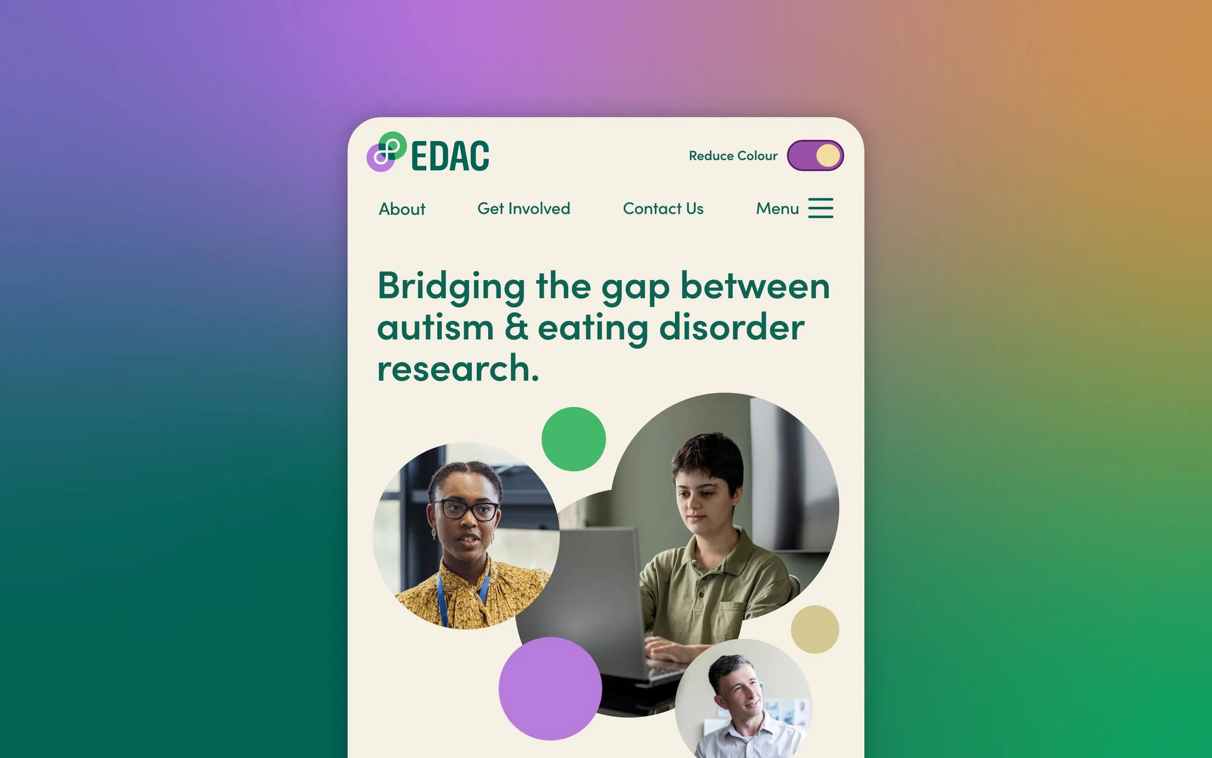
We learned that the infinity loop is a really popular modern symbol for autism and neurodiversity as a whole, and we wanted to capture these positive feelings and associations and put them at the heart of our branding for EDAC.


Breaking out of neurotypical design habits
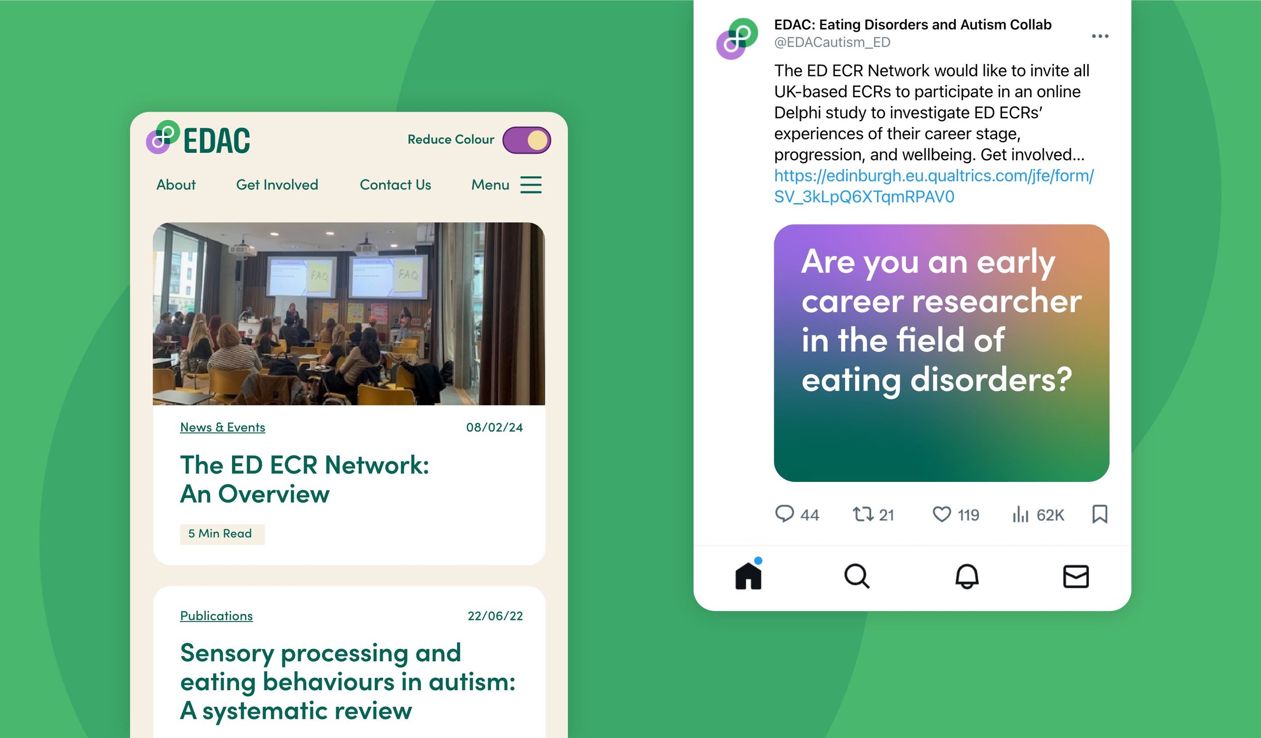
EDAC’s website is the launchpad for a new generation of eating disorder researchers who will grow the network and achieve their ambition of Autistic-led change. It needs to move, motivate and enable the different people who can make this happen; Autistic people with eating disorders, autism / eating disorder researchers and Early Careers eating disorder researchers among others. We developed the content structure alongside EDAC’s research team who were brimming with ideas and insights to make the content that everyone wants and needs. The challenge for us was to design a user interface that puts Autistic people first and feels right for everyone.
By studying a number of online resources for good autistic user experience including The Neurodiversity Design System we were able to highlight the most important design principals for accessibility; consistency, clarity and structure.

But, beyond this top level thinking we wanted to understand more about the usability of content – Autistic people spend most of their time online avoiding sensory overload and confusion on websites designed by neurotypical people for neurotypical people. We went to the EDAC network to ask for feature ideas that would make a difference – developing and testing the functionality with our neurodiverse studio manager Gabriella, who was able to help us break out of neurotypical design habits.
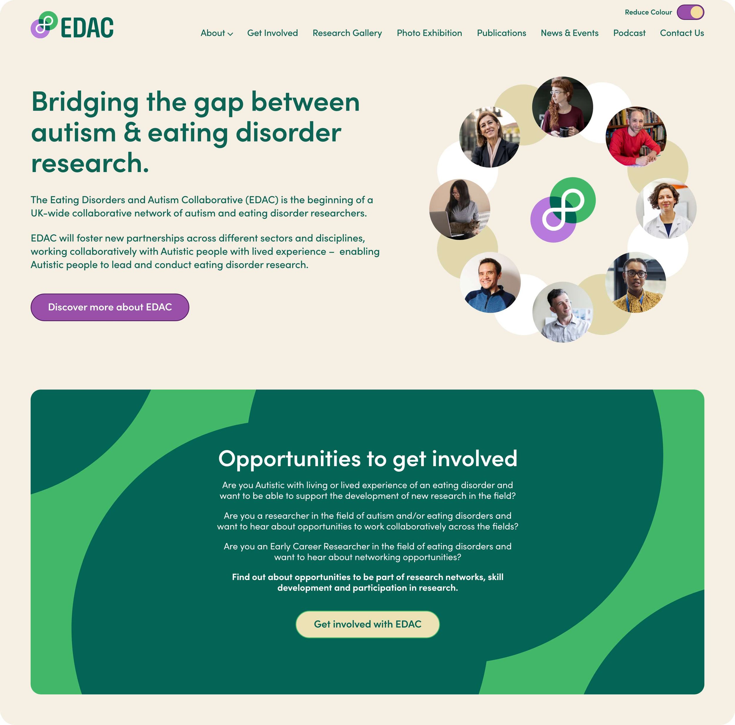
Colour is a huge contributor to sensory overload for Autistic people online. It’s subjective to individuals but softer tones are generally best and being able to control colour is even better. We designed a simple colour reduction toggle in the persistent navigation to give quick, easy control.
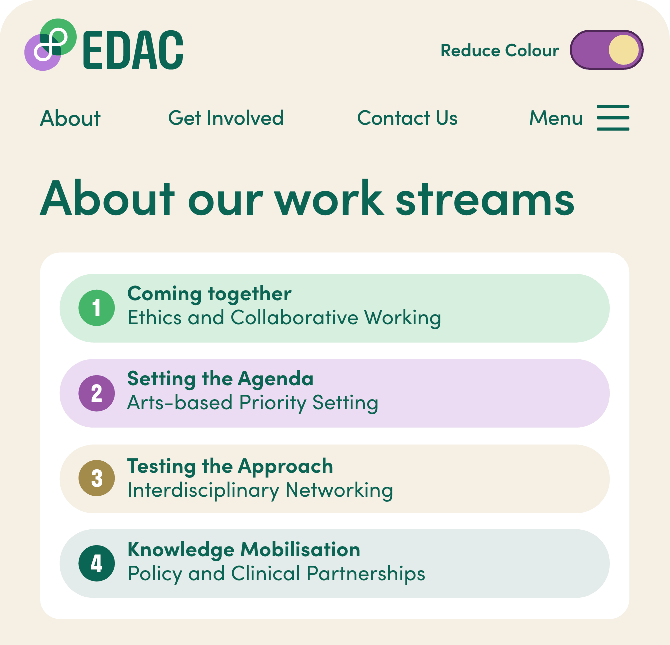
Simplicity, stability and predictability came up a lot in our research as important factors in a user interface – uncontrollable animations and videos, popups, abstract and complex text and image decorations – all staples of the digital world but mostly unbearable and disorientating for Autistic people. We focussed on using relatable, humanising imagery only when it helps give a visual explanation or context for the brand and content. We learned that meaningful text and visual cues really help by making links and onward journeys more understandable and predictable.

More recent work
Healthcare Marketing
Click here to see how our specialists could bring your marketing to life

We’re a Trusted NHS Marketing Partner
Video, digital, out-of-home and beyond – we deliver NHS campaigns and products that make a difference.
MyOhana
Branding, digital & print for feel good childcare